Thematic Drawing Reflecion (3-D): October 30, 2012
Overall design
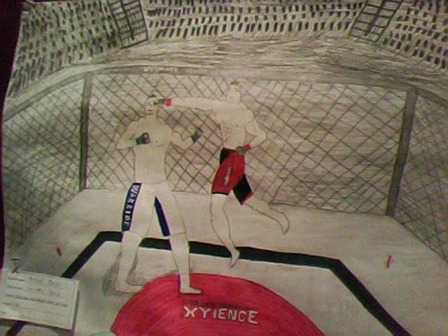
Overall design of 'Superman Punch.' I called it that because that's the move the fighter in the red and black trunks is performing and landing on his opponent in the white and blue trunks.
Close ups
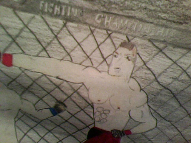
Close up of the fighter who's beating his opponent up pretty badly. He has brown hair, caucasian skin, rippling muscles, and appears to have a slight cut under his left eye, so it appears that the fighters may be evenly matched, and the fight could've been going back and forth.
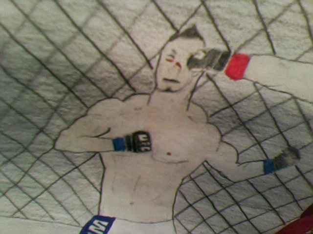
Close-up of the fighter getting punched. He has a black fohawk, jawline beard, big traps, and good muscle mass, although he's not as defined as his opponent. He has some pretty bad cuts on his nose and under his right eye, so it appears that his opponent is beating him up pretty badly.
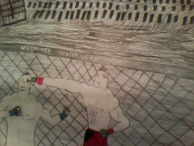
Both fighters, primarily based on the puncher.
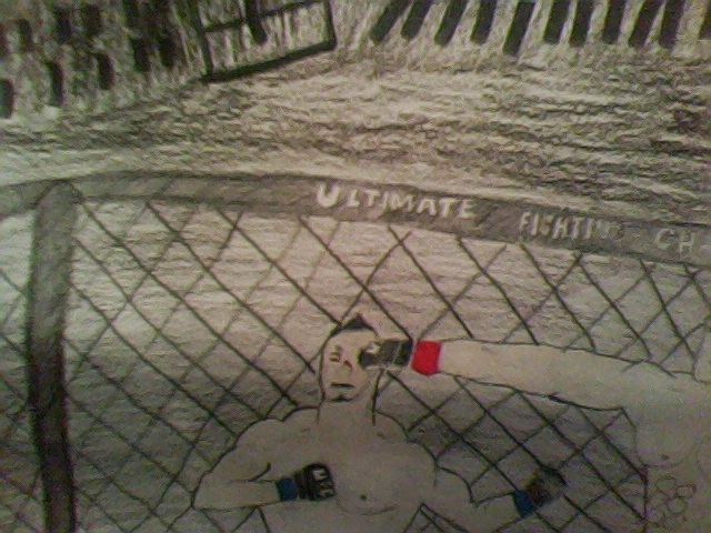
Picture of fist in face.
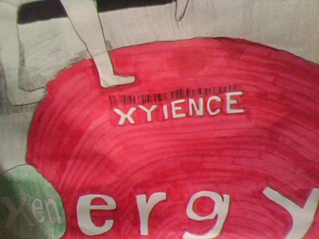
Close up of the Xyience logo in the center of the mat. I like xyience, but it's also there because it's the official energy drink of the UFC, and usually in the center of the mats anyways.
Preliminary designs
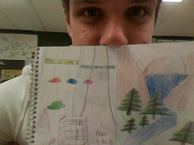
My first set of preliminary designs. My least favorite is the one on the top left I called 'Future City New Year.' It had flying cars, much taller skycrapers, and a big holographic party hat. I liked he one next to it I called 'The Great Outdoors.' Some scenary I feel thats pleasant, some grass spots with trees with a river flowing through into a nice valley of mountains.
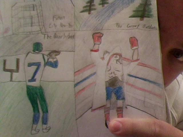
My next set of preliminary's consist of a sports theme. The first one on the left is called 'The Quarterback.' The title pretty much explains itself, a quarterback is waiting in the pocket looking down the field for an open receiver. The one on the right is called 'The champion.' It's my favorite preliminary, and I wanted to base my overall design on a big fighting moment. This one is of a boxer waiting in his corner while his name is being announced. He has caucasian skin, a white and red entrance coat, red gloves, red socks, white shoes, blue trunks, and the World championship around his waist.
1. I like my special features in the fighters physical appearance, like the muscles and the cuts, because they stand out and make them look tough.
2. Blending the background colors and its' stroke techniques, because it looks like it was added too quickly.
3. There are two fighters, and one is connecting with a superman punch, and I did this because I love the sport and I wanted to make everything stop and create an image that stands still in time, and gives an awesome image.
4. Grays, because it was the color of the mat, and it faded off into a darker gray in the background. I also used red which should stick out because it is in the big xience logo in the middle of the mat, and was one of the base colors in one of the fighters shorts.
5. The emphasis is the fighters, because I outlined them in a dark pencil layer, and the xience logo in the middle of the mat because it has size and a bright red emphasis color.
6. I learned to take your time and get everything right. Because in order to have a well done or successful project, you need to get everything the way you want it to be, and take your time in order to do so.
7. I started onthe fighters because they were the thing I wanted to stick out, and nothing was in front of them. I then did the mat, then the cage, and then the audience last. I did it this way because in drawing or sketching, you always work form front to back.
8. I'd say it is, because it gives you the freedom to work on anything you want, and it can be a lot of fun. Maybe give us more time like a day or two.
