Overall
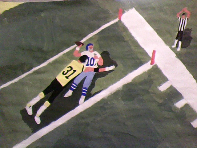
Here is my overall painting. The design is of a quarterback getting sacked in the endzone for a safety.
Close Ups
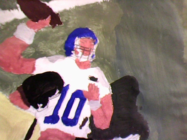
Here is a close up of the Quarterback. He has grassy dirt stains on his jersey to show that he's been taking a beating all day.
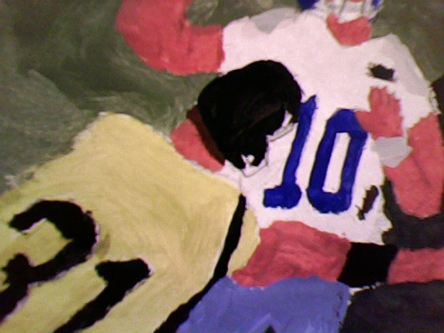
Here is the tackler. He has some bulging arm muscles and some brown hair sticking out of the back of his helmet.
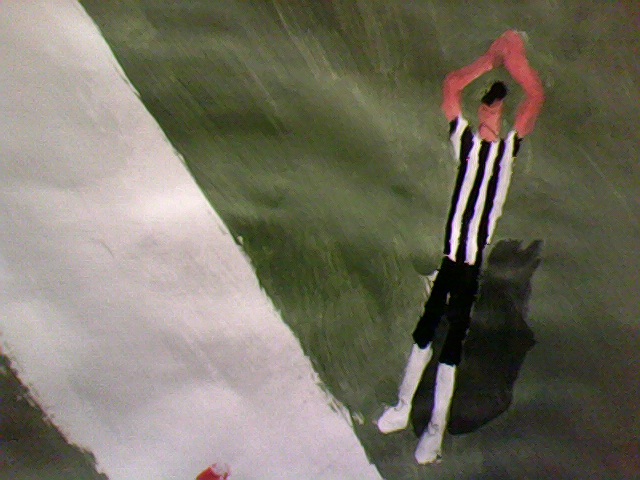
Here is the referee. He is holding two hands up and together indicating the signal for a 'safety.'
Preliminary Designs
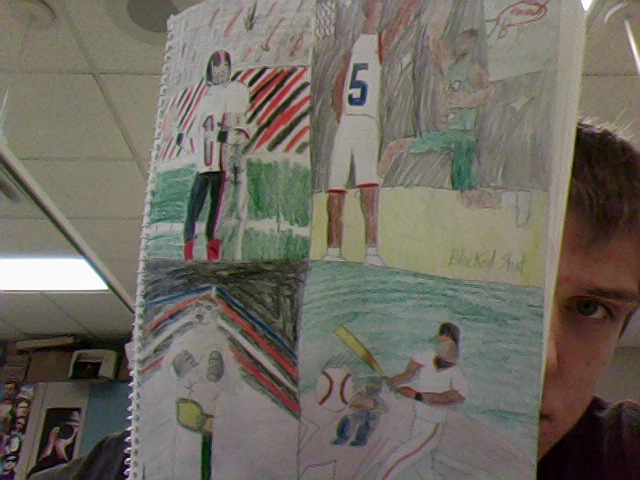
Here are my first four preliminary designs. he first is 'The Quarterback' as the qb looks down the field for an open reciever. The next is 'Blocked Shot' as a bigger basketball player swats away a layup. The next is 'Heavyweight Champion' as an MMA fighter poses with his championship belt aorund his waist. The last is 'Big Hitter' as the batter smashes a ball back up the field.
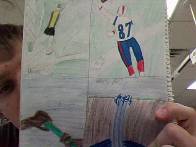
Here is my next set of preliminary designs. The first is 'Discus' as a discus thrower twirls then launches the disc down a field. The next 'One Hand Snag' as a player is down by the sidelines and makes a one handed catch in bounds. The next is a simple one, the 'Hand Off' between two track runners as one hands the paton off to another runner in a relay race. The last one is 'Waterfall' as a nice scenary of a waterfall.
Project Questions
1. I thought I did good on my grass, because it's variety of shading looked realistic. I also like how I used realistic shading because it helped the players pop out and catch attention.
2. I probably could have went back and it look better and less flat with my strokes because to me, it looks really sloppy.
3. My theme is of a quarterback getting sacked in the endzone for a safety. It represents domination. I chose this because I did this last year and it felt really good, I felt powerful.
4. Green, because it's the color of grass and that takes probably 3/4 of my entire painting because it's on a football field. Grass represents life I guess, and the football field everything is live, action.
5. My light value, or tints, is in my white lines and in the uniforms of the quarterck and the tackler's yellow. My dark values, or shades, are in the shading underneath the players and ref.
6. You should be as creative as you can, because sometimes you could look back and say 'hmm, I could've done a lot better.' I also learned how to clean my paint tray properly because Mr. Purdy kept me after to class and taught me how to clean it properly.
7. First I sketched out my design. Then I filled in my grass because it is the background majority color, and it fills the paper. Next, I filled in my people's colors. Last, I put on the shading because it help the people pop out.
8. I'd say it was pretty worthwhile because it gives you freedom to really stretch out to new grounds and blends and designs. I still say we need more time to exceed because it's pretty tough to do any of those exceedings with the time required.
